From Owen Jones, talking to Professor Steve Keen, who correctly forecast the GFC. He reckons the current AI boom will fizzle out within a year, to be followed by an AI bust as AI takes over more and more jobs. He points out that a UBI will be essential, or people will starve to death, and there will be severe civil unrest, a dystopian "Hunger Games" scenario. A new Great Depression, leading to massive economic and social change.

Showing posts with label GFC. Show all posts
Showing posts with label GFC. Show all posts
Thursday, December 11, 2025

Saturday, August 23, 2025
Emissions have peaked
Two recent graphs, from different articles, have given me hope that we might yet avoid catastrophic global warming. The first chart come from Carbon Brief, which I referenced here.

Let's dig deeper into the chart.
It shows the smoothed year-on-year change in electricity demand in China, and the year-on-year change in the supply of electricity, broken down into fossil fuels (mostly coal, but some gas) and clean energy. Over the last 20 years, there have been 5 times when production of electricity from fossil fuels has fallen: in 2009 (the GFC); in 2012/13 (the Euro crisis); in 2016 (a global mid-cycle correction which was quite severe in China); in 2022 (Covid lock-downs); and this year.
This year is the first time that fossil fuel production has fallen when electricity demand growth is strong. Notice how the size of the pale blue bars (renewables) has got bigger and bigger, as China has installed exponetially increasing quantities of wind, solar and batteries. Second, notice how electricity demand has grown, as (a) the economy grew, and (b) EV sales exploded, with each peak tending to be higher than the previous one.
Right now, an annual expansion in clean energy production of +-600 terawatt-hours (TWh) is enough to more than satisfy demand, causing fossil fuel generation to decline. The 20-year average annual increase in demand is 400 TWh, while over the last 8 years or so, it looks about 500 TWh. Obviously, if China's growth accelerates back to the heady rates on the early 2000s (10% a year), given how much richer China is now than then, the increase in demand could easily exceed 800 TWh. However, growth is unlikely to accelerate back to those levels The recent GDP trend growth rate is about 7%, and, in my judgment, slowing, as China deals with its property crisis. (Also, China overstates its GDP growth data, so the real growth rate is lower. The data for growth in electricity demand and supply are better quality.)
The second chart came from an article by the ABC, which I commented on here.

The projected increase in new clean energy generation capacity for the next 2 years is about 600 TWh. In other words, it's now more than the average rise in electricity demand.
Of course, there is an economic cycle, with demand rising at 800 TWh in boom years, and reducing to 200 to 400 TWh in slower years. So we may have a pattern of falling emissions during low-growth years, followed by modest rises when the economy is stronger. Yet this doesn't take into account the exponential growth in new wind and solar output over the last 7 years. It's risen from 200 TWh to 600 TWh in just five years. And although the forecast for the next two years is for only limited growth, the costs of solar and batteries contimue to decline rapidly. The exponential growth will continue. By 2028, new clean energy output will be increasing by 800 TWh a year, or more, so that even in high growth years, Chinese emissions from electricity generation will be falling.
China is by far the world's largest emitter of CO2, causing over 25% of global emissions, compared with the US at 18%, and the EU at 17%. Europe's and the USA's emissions peaked years ago:
 |
| Source: Our World in Data |
What this means is this: if China's emissions have peaked, global emissions have probably peaked too.
It's true that the Trump administration has embarked on an utterly demented attempt to return the USA to the 1950s, but cheap Chinese solar panels, batteries and EVs, are persuading the rest of the world (for example, Pakistan)---the other 80% of emissions---to switch to clean energy. Plus, Trump's high-handed trashing of tariff and trade agreements means that the USA's opposition to carbon border taxes will not be effective. If the USA can arbitrarily raise tariffs, then so can the rest of the world. And they will. Moreover, renewables are much cheaper than fossil fuels. As electricity prices soar in the USA, cooler heads might prevail.
The peak in global emissions doesn't mean global temperatures will stop rising. Emissions will have to fall by 90% for that to happen. But what these devlopments do mean is that emissions are now in secular decline. And the sustained fall in the costs of clean energy means that the decline will accelerate as renewables and EVs get ever cheaper. As the impacts of catastrophic global heating worsen, the world will take stronger and stronger measures to slash emissions.
Temperatures will go on rising, but for the first time, it looks as if, by the 2040s, the decade-by-decade increases will start falling.
Friday, July 28, 2023
Austria points towards deep Euro recession
As always, the PMI for Austria is one of the earliest released for the latest month. Austria is so embedded in the economy of the whole of Europe that what happens there is a good guide to what's happening in Europe as a whole.
Austria's PMI fell again in July, deeper into recession territory.
S&P Global's commentary is illuminating:
Austria's manufacturing sector endured a difficult start to the third quarter, according to the latest UniCredit Bank Austria PMI® data produced by S&P Global, registering a sharp and accelerated drop in production levels alongside a nearrecord fall in factory gate charges. The decline in backlogs of work across the sector meanwhile gathered pace as demand continued to fall, which in turn led to increased pessimism among firms towards the outlook and a pick-up in the rate of job losses.
The seasonally adjusted UniCredit Bank Austria Manufacturing Purchasing Managers’ Index® (PMI®) – a single-figure gauge of performance calculated from measures of new orders, output, employment, supplier delivery times and stocks of purchases – edged deeper into sub-50 contraction territory in July, falling from June's 39.0 to 38.8. This was its lowest reading since April 2020. The drop in the headline index reflected faster declines in output, employment and stocks of purchases.
The rate of decline in production in July was the quickest seen for over three years. Where output schedules were scaled back, surveyed firms generally attributed this to reduced inflows of new orders and an associated drop in backlogs of work.
A fifteenth straight monthly decline in new orders was recorded in July, amid reports of customer destocking, tighter financial conditions, weaker demand from the construction sector and general client hesitancy. Although easing slightly from the previous month, the rate of contraction remained sharp and was still quicker than that of output. Contributing to the decline in total new business was a sustained sharp downturn in international sales.
A lack of incoming new orders to replace completed projects saw manufacturers' backlogs of work continue to fall during July. Furthermore, the rate of depletion accelerated to the quickest since May 2020.
[And so on .....]
You can see from the graph in S&P Global's report that Austria's PMI is heading back towards 2009's GFC (Global Financial Crisis) lows. Across Europe, services are still holding the overall economy up. But only just --- and services are starting to slide too. Not to mention that the ECB (European Central Bank) has just raised interest rates. Again.

Saturday, July 1, 2023
Fed Funds and the economy
Changes in interest rates cause swings in economic activity, but with a lag. The lag varies from cycle to cycle and economy to economy. Also, when interest rates rise, they cause the economy to fall (with a lag). And when they fall, they cause the economy to recover (again with a lag, though the lag may be different from when interest rates are rising). So, in the chart below, the change in the Fed Funds rate is plotted inverted, with a lag. I have chosen an 18 months lag, but as I said, it varies from cycle to cycle. With the GFC (2007-2009) the lag was longer, for reasons I've discussed before.
What this indicator points to is a recession as deep as the GFC, and a lower turning point at the end of 2024.
 |
| The QCI is an equally-weighted average of the volume of retail sales, industrial production, and non-agricultural employment. It closely tracks quarterly GDP. |
Tuesday, June 13, 2023
Yield curve points to deep recession
The yield curve --- here, the gap between the 10-year bond yield and the cash rate/discount rate --- is a reliable lead to economic activity. The yield curves for both the US and the world are at record (my records, anyway) lows. The economy lags the yield curve by between 1 and 2 years. The yield curve may be troughing, but even if it is, the minimum lag before the economy turns is 12 months, which suggests an earliest turning point in mid 2024.
The last time the yield curve was this negative was in the months before the GFC (global financial crisis) in 2007.
 |
| Click on chart to see clearer image |
Friday, May 5, 2023
Half of America's banks insolvent
From The Age
The twin crashes in US commercial real estate and the US bond market have collided with $US9 trillion ($13.5 trillion) uninsured deposits in the American banking system. Such deposits can vanish in an afternoon in the cyber age.
The second- and third-biggest bank failures in US history have followed in quick succession. The US Treasury and the Federal Reserve would like us to believe that they are “idiosyncratic”. That is a dangerous evasion.
Almost half of America’s 4800 banks have already burnt through their capital buffers and are running on negative equity. They may not have to mark all losses to market under US accounting rules, but that does not make them solvent. Somebody will take those losses.
“It’s spooky. Thousands of banks are underwater,” said Professor Amit Seru, a banking expert at Stanford University. “Let’s not pretend that this is just about Silicon Valley Bank and First Republic. A lot of the US banking system is potentially insolvent.”
The full shock of monetary tightening by the Fed has yet to hit. A great edifice of debt faces a refinancing cliff-edge over the next six quarters. Only then will we learn whether the US financial system can safely deflate the excess leverage induced by extreme monetary stimulus during the pandemic.
A Hoover Institution report by Professor Seru and a group of banking experts calculates that more than 2315 US banks are currently sitting on assets worth less than their liabilities. The market value of their loan portfolios is $US2 trillion lower than the stated book value.
These lenders include big beasts. One of the 10 most vulnerable banks is a globally systemic entity with assets of over $US1 trillion. Three others are large banks. “It is not just a problem for banks under $US250 billion that didn’t have to pass stress tests,” he said.
The US Treasury and the Federal Deposit Insurance Corporation (FDIC) thought they had stemmed the crisis by bailing out uninsured depositors of Silicon Valley Bank and Signature Bank with a “systemic risk exemption” after these lenders collapsed in March.
The White House baulked at a blanket guarantee for all deposits because that would look like social welfare for the rich. Besides, the FDIC has only $US127 billion of assets (and less very soon) and may ultimately require its own bailout.
The authorities preferred to leave the matter vague, hoping that depositors would discern an implicit guarantee. The gamble failed. Depositors fled First Republic Bank at a fast and furious pace last week despite an earlier infusion of $US30 billion from a group of big banks.
White knights probing a possible takeover of First Republic recoiled once they examined the books and discovered the scale of real estate damage. The FDIC had to seize the bank, wiping out both shareholders and bondholders. It took a $US13 billion subsidy along with $US50 billion of loans to entice JP Morgan to pick up the pieces.
“No buyer would take First Republic without a public subsidy,” said Krishna Guha from Evercore ISI. He warns that hundreds of small and mid-sized banks will batten down the hatches and curb lending to avoid the same fate. This is how a credit crunch begins.
The share price of PacWest, the next on the sick list, fell as much as 60 per cent in after-hours trading on Wednesday. That will be the bellwether of what happens next.
The US authorities can contain the immediate liquidity crisis by guaranteeing all deposits temporarily. But that does not address the greater solvency crisis.
The Treasury and the FDIC are still in the denial phase. They blame the failures on reckless lending, bad management, and over-reliance on footloose uninsured depositors by a handful of banks. This has a familiar ring. “They said the same thing when Bear Stearns went down in 2008. Everything was going to be all right,” said Seru.
First Republic lends to technology start-ups, but it chiefly came unstuck on commercial real estate. It will not be the last on that score. Office blocks and industrial property are in the early stage of a deep slump.
“Where we stand today is a nearly perfect storm,” said Jeff Fine, real estate guru at Goldman Sachs.
“Rates have gone up 400 to 500 basis points in a year, and financing markets have almost completely shut down. We estimate there’s four to five trillion [US] dollars of debt in the commercial (property) sectors, of which about a trillion is maturing in the next 12 to 18 months,” he said.
Packages of commercial property loans (CMBS) are typically on short maturities and have to be refinanced every two to three years. Borrowing exploded during the pandemic when the Fed flooded the system with liquidity. That debt comes due in late 2023 and 2024.
Could the losses be as bad as the subprime crisis? Probably not. Capital Economics says the investment bubble in US residential property peaked at 6.5 per cent of GDP in 2007. The comparable figure for commercial property today is 2.6 per cent.
But the threat is not trivial either. US commercial property prices have so far fallen by just 4 per cento 5 per cent. Capital Economics expects a peak to trough decline of 22 per cent. This will wreak further havoc on the loan portfolios of the regional banks that account for 70 per cent of all commercial property financing.
“In a worst-case scenario, it could create a ‘doom loop’ which accelerates a real estate downturn that then feeds back into the banking system,” said Neil Shearing, the group’s chief economist.
Silicon Valley Bank’s travails were different. Its sin was to park excess deposits in what is supposed to be the safest financial asset in the world: US treasuries. It was encouraged to do so under the risk-weighting rules of the Basel regulators.
Some of these debt securities have lost 20 per cent on long maturities – a theoretical paper loss only until you have to sell them to cover deposit flight.
The US authorities say the bank should have hedged this Treasury debt with interest rate derivatives. But as the Hoover paper makes clear, hedging merely transfers losses from one bank to another bank. The counterparty that underwrites the hedge contract takes the hit instead.
The root cause of this bond and banking crisis lies in the erratic behaviour and perverse incentives created by the Fed and the US Treasury over many years, culminating in the violent lurch from ultra-easy money to ultra-tight money now under way. They first created “interest rate risk” on a galactic scale: now they are detonating the delayed timebomb of their own creation.
Chris Whalen from Institutional Risk Analyst said we should be wary of a false narrative that pins all blame on miscreant banks. “The Fed’s excessive open market intervention from 2019 through 2022 was the primary cause of the failure of First Republic as well as Silicon Valley Bank,” he said.
Mr Whalen said US banks and bond investors (ie pension funds and insurance companies) are “holding the bag” on $US5 trillion of implicit losses left by the final blow-off phase of the Fed’s QE experiment.
“Since US banks only have about $US2 trillion in tangible equity capital, we have a problem,” he said.
He predicts that the banking crisis will keep moving up the food chain from the original outliers to mainstream banks until the Fed backs off and slashes rates by 100 basis points.
The Fed has no intention of backing off. [It raised rates further this week to the highest level in 16 years, and chair Jerome Powell warned not to expect any rate cuts this year]. It continues to shrink the US money supply at a record pace, with $US9 billion of quantitative tightening each month.
The horrible truth is that the world’s superpower central bank has made such a mess of affairs that it has to pick between two poisons: either it capitulates on inflation, or it lets a banking crisis reach systemic proportions. It has chosen a banking crisis.
 |
| The rise in the US discount rate from 1% in 2004 to 5.3% in 2006 led to the GFC. The rise this cycle has been even larger. |
Monday, April 10, 2023
Just how deep will the US recession be?
Readers of this blog will know that I have worried about this issue for many months now.
Here are two more charts which strongly suggest that a deep recession is possible. They show data back to 1970.
The first chart shows the 12-month change (absolute, not percentage) in the Fed Funds rate. The Fed Funds rate is the rate the Federal Reserve Bank charges for overnight borrowings by banks from the Federal Reserve system. It is the bellwether which sets the level of interest rates in the market. In the chart, I have plotted it upside down, because when interest rates rise, the economy slows, and when they fall, the economy accelerates. I have also moved it forward, that is, I have plotted it with an 18-month lag, because it takes a long time for the change in rates to take effect.
The QCI is a monthly coinciding index (i.e., it coincides with the business cycle), which closely tracks real GDP.
Notice how close the relationship between the change in rates and economic activity is, except for the GFC (2008/2009), where the downturn was materially worsened by the half-witted orgy of ill-advised mortgage lending by the banks in the years prior to the Fed raising rates. The inevitable hangover took down the banking system and everything else with it.
The other apparent break in the relationship was caused by the Covid Crash of early 2020. This also caused the spike in the QCI in early 2021 via the year-on-year calculation.
The rise in rates (shown in the chart as a fall, because, remember, it's inverted) is consistent with the deep recessions of 1973-1975 and 1980-1982. The only good news is that this indicator (the inverted change in Fed Funds) is bottoming---provided the Fed doesn't raise the Fed Funds rate from now on.
 |
| Click on chart to see clearer image |
The second chart shows the rate of change in real (i.e., after allowing for inflation) money supply. The data for both M1 and M2 appear to have been distorted in early 2020 by a definitional/regulatory change by the Fed affecting the classification of chequing and savings accounts. It's partly this change which may have caused the spike in the year-on-year rate in 2020/21. But the spike was prolly also caused by the Fed flooding the system with liquidity. However, this distortion is now passed.
Real money supply is falling faster than it has done at any time in the last 63 years (1960-1970 not shown in the chart). It's falling faster than it did before the 1973–1975 and 1980–1982 recessions, and they were, before the GFC, the deepest recessions the USA has experienced since the Great Depression. The implication is that the US is likely to experience a recession as deep as those two. In other words, not a "soft landing". See this interesting analysis from Reuters.
 |
| Click on chart to see clearer image. Note: money supply charts not plotted with a lag. |
So I remain sure that the US will experience a recession this year, with a peak-to-trough fall in real GDP of 3-5%, and a rise in the unemployment rate of 5-6%.
What could prevent these outcomes? Well, Covid has distorted many indicators, and many economic relationships. So time-honoured linkages and drivers may no longer work. I think that, though possible, this is very doubtful.
Of the Big 8, the US, Europe, the UK, Brazil and Russia are themselves likely to go into recession or are already in one this year. China is rebounding, and India is still growing strongly. On balance, the rest of the world won't save the US. In the past, it usually went the other way---US recessions transmitted themselves to the rest of the world. (The China rebound will likely reduce the depth of Australia's recession, though our Reserve Bank has also raised rates by too much.)
During the 1973-1975 recession, the S&P500 fell by 44% peak to trough. During the 1980-1982 recession, it rose at first before falling by 20%. During the GFC, it fell by 57%. However, the banks are much better capitalised now than they were when the GFC began, and the kind of financial crisis we experienced then is less likely (but by no means impossible) today. So far this cycle, the S&P500 is down just 14%. The risks, surely, are on the downside.
Monday, February 27, 2023
Philly Fed & Empire State surveys still sliding
Two regional Fed surveys come out early in the month, giving us a good guide to trends in the whole US economy. Because they only cover the NE United States, their results are not conclusive; nevertheless, the correlation is close. Because the monthly data are "spiky", I've extreme adjusted and smoothed them. We are still not yet at the depths of the GFC in 2008/9, but we're heading in that direction.

Friday, January 27, 2023
The Fed funds rate and the cycle
Key to our perceptions of the economy and stock, bond and commodity markets is the relationship between interest rates and the business cycle. Has the economy bottomed? Or is it likely to fall deeper into recession? If it does, how long will the recession last?

The chart above compares the *change* over 12 months in the Fed's target Fed Funds rate with the year-on-year change in my monthly GDP proxy. Because a rise in interest rates leads to a fall in economic activity, the change in the Fed's target Fed Funds rate is plotted inverted. That is, rising interest rates are shown as negative. For example, the rise in the Fed Funds rate over the last year, from 0% to 4.3% is plotted as a decline. Doing it this way makes it easier to compare changes in interest rates with economic activity. Also, because interest rates affect the economy with a lag, the red line (the change in fed funds rate, inverted) has been shifted sideways (lagged) by 18 months. This gives you an implicit forecast of the likely change in economic activity over the next 18 months.
It's a little more complicated than that. First of all, the lag isn't fixed. As you can see, from 85 to 94, the lag was closer to 2 years. On the other hand, it seems to be much longer with the GFC in 2008. But over the last 15 years, 18 months has been about right.
Second, the amplitude of the declines in economic activity varies. However, the two occasions with the biggest variation were with the GFC (2008) and the Covid Crash (2020). The GFC was made much worse/deeper by the US mortgage crisis, after banks foolishly lent billions to borrowers who were unable to pay. Debt defaults and bank crashes are often a consequence of central bank tightening and subsequent recessions, but this time round it was much worse.
The Covid Crash caused a very deep but very short-lived recession. It wasn't caused by monetary or fiscal policy.
Take those two out, and the fit is much better.
Based on the relationship over the last 40 years, we would expect a recession as deep as the GFC over the course of 2023 and H1 2024. And that's before any debt defaults and bank failures. And before we take into account any fiscal tightening as the big covid deficits get scaled back.
OK, so could the relationship be about to break down? Why would it? Well, perhaps with Covid, supply bottlenecks, and war, these old (and logical relationships) might not work, for now. I'm not quite sure why this should happen, but it exists as a possibility. The world has turned topsy-turvy over the last 3 years.
A better argument is that in real terms, i.e., after inflation is removed, the Fed Funds rate is still negative. In other words, the monetary tightening by the Fed is much less than it appears on the face of it. The problem with that hypothesis is two-fold. First, inflation expectations haven't lifted anywhere near as much as headline inflation, and it's inflation expectations which matter. More important, the direct resultant of rising interest rates, money supply, is falling in real and nominal terms. And actual prices matter for real money supply.
At our Christmas function in 2007, I told clients that there was a serious risk of a deep downturn in 2008. Mortgage default rates had reached record highs during an upturn. If there was a downturn, default rates were likely to double, and that would take down the banking system. When the first payrolls data came in on January 7th 2008, I recalled our dealer from his holidays and I went into the office (I was also supposedly also on holiday) and we sold half the liquid shares, leaving small caps for later. The consensus at the time was that there would be no recession and that the payrolls data were a 'blip'. That consensus was completely wrong.
Once again, the consensus is clear: the US will experience a soft landing at worst. Stock markets are rallying on the back of this.
I suspect the consensus is wrong again.
Of course, the consensus may be right, and I may be wrong. We shall see.
Sunday, January 22, 2023
US existing home sales point to GFC recession
Existing home sales in the US, like most time series associated with the housing sector, lead the cycle.
The chart below shows home sales vs my monthly indicator, which tracks GDP quite well. Note how home sales peaked in 2005, but only really started to fall fast in 2007. This plunge preceded the GFC (global financial crisis) of 2008/2009. History seems to be repeating itself. However, as bond yields and therefore mortgage rates may have peaked, home sales may be close to a trough. If there is a deep recession, the trough may be postponed. Banks are in a much sounder financial state than they were then, on the face of it, but there's plenty of debt owed by emerging markets and zombie companies. What drove the GFC to its depths was actual and potential banking collapses. What will (most probably) drive the current cycle into its depths will be the surge in commodity prices, which only peaked in June last year, and central banks overtightening.

Monday, January 9, 2023
Oil price likely to go on falling
As the world economy slows, the oil price will fall. I expect a GFC-style recession in 2023/24 and its impact on oil will be compounded by rise of EVs, which were 0% of global car/light truck sales in 2008, but are 15% now, and 30% in China.

Saturday, October 1, 2022
Neoliberalism fails everywhere it's been tried
We've seen the collapse of neoliberalism in the UK, and the USA. The Saturday Paper in Australia sums up why it's failed here too. And the lessons apply everywhere.

Friday, September 2, 2022
US momentum indicators slip again in August
I extreme-adjust many of the time series I monitor. This evens out spikes up or down, and allows us to see the underlying trends more clearly. The chart below shows the extreme-adjusted and the unadjusted data for the ISM (Institute of Supply Management) survey of manufacturers in the USA. Most of the time, as it should be, the extreme-adjusted data are the same as, or only slightly different from the unadjusted data. However, when there is a large spike up or down, the extreme-adjustment algorithm reduces the spike. The most notable recent examples are the down spike from the Covid Crash in 2020 and the up spike from the recovery in 2021.

There are two national surveys of manufacturing conditions. The one above is from the Institute of Supply Management; the other is from S&P Global's PMI (Purchasing Manager Index) survey. If we average these two series after extreme-adjusting them, we should get an even closer picture of fundamental underlying trends, because these two series are (statistically) independent, having different samples, different survey days in the month, different methods of combination.
You can see this in the chart below, where the green line shows the average of the extreme-adjusted ISM and PMI surveys, which is smoother than either survey individually.
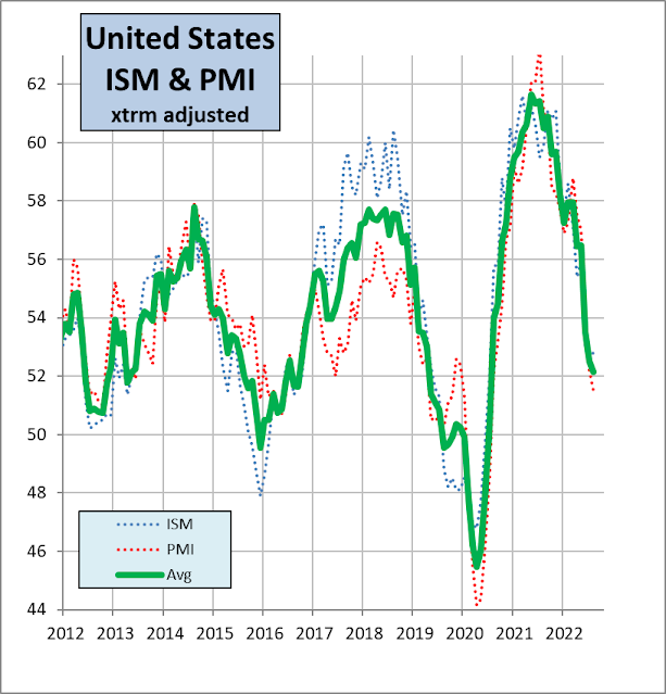
The key conclusions:
- The US economy continues to slow, but ...
- ... because a data point above 50% shows expansion, the economy is still expanding, just more slowly
- The 'green line' (average of the two surveys) is likely to cross the 50% level in December this year or January next year.
The Fed will keep on raising rates until core inflation is back at around 2%, which is some months away. PMI data suggest input cost inflation is receding, so it may not be too many months. However, the gap between the Fed's target core inflation (2%) and current inflation (6%), is still high. As economies respond to changing interest rates with a lag, the downward momentum won't immediately abate even when the Fed stops upping the Fed Funds rate, and stops quantitative tightening. Recession seems inevitable, and a deep recession, à la GFC, is unfortunately very likely.
Friday, July 8, 2022
So when will shares bottom?
Typically, stock markets often show a cyclical turning point when they decide that Central Banks are going to start cutting interest rates, or perhaps, going to stop raising them. Stock markets turn up before the economy turns up, and they turn down before the economy turns down.
Central bank discount rates (such as the Fed Funds rate, the Bank of England base rate, or the Reserve Bank of Australia cash rate) tend to lag behind the cycle. The chart below shows the year-on-year change in GDP-weighted world average central bank rate, calculated for countries representing 83% of world GDP, compared with the GDP-weighted average PMI of the "Big 8" economies. Observe how the average Central Bank discount rate goes on rising for a year after the PMI peaks. So we might expect the world discount rate to start to peak about now, a year after the Big 8/world PMI peaked (June last year). The problem is, the US only started raising the Fed Funds rate 3 months ago, and is nowhere near through a typical rate rise cycle. And the European Central Bank hasn't even *started* raising its discount rate yet. On top of which, inflation is at 40 years records, and so far, still rising.

So the risk is that the world discount rate will keep on rising.
In addition, the huge jump in commodity prices is setting up the world for a deep recession ― perhaps as deep as the one after the 1972 commodity price boom. Probably as deep as the GFC (global financial crisis) in 2008. In that crisis, even though discount rates were plummeting, the stock market didn't bottom until March 2009, when it started to appear plausible that economies would recover. If we look at the 1974 and 2008 bear markets, which were associated with deep recessions, the share market continued to fall even though interest rates were being cut. That could happen again.
Interesting times.
Saturday, May 14, 2022
Russia business confidence, and other things
I've been off-line, more or less, due to medical issues, plus I also wanted to work on my Visual Basic programs, adjusting my seasonal adjustment programs to handle time series which go negative. The latter took a lot of work, because the assumption that time series were positive (e.g, the PMI, or industrial production, say) was embedded in all sorts of small but crucial software segments. Also, Visual Basic makes the strange assumption that zero ('0')is the same thing as 'empty', which it most emphatically isn't. It took me hours to discover this!
Why did I want to be able to seasonally and extreme adjust time series which go negative? Because I wanted (specifically) to analyse the Russian business confidence data, partly as part of my attempt to estimate the Russian PMI prior to 2011 (my data stop there) and partly because it will be interesting to see just how deep business confidence falls in Russia as the war progresses and sanctions bite, and (generally) because one does from time to time need to seasonally and extreme adjust time series which go negative.
The chart below shows the original (unadjusted) data for business confidence plus my calculation of the seasonally and extreme adjusted data. Note the very strong seasonal cycle, with business confidence plunging in winter and recovering in summer (why? I know Russian winters are bad, but ....) Also, business confidence has been more or less negative for the last decade-plus. Which is consistent with the sharp decline in US$ GDP since 2013, after the annexation of Crimea. (GDP chart second below; note optimistic forecast for 2022 GDP!)

 |
| Source: Trading Economics If the 2011-2013 growth rate had continued, Russia's GDP would now be *double* what it is now. Does Putin understand that in the long run, power comes from economic not military might? That his yearning for great power status would come from sustained economic growth? But that would imply the end of the kleptocracy, and we can't have that, can we? |
How does business confidence compare with the PMI for Russia? I show that in the chart below. I expect both the PMI and business confidence to fall sharply over the next 6 to 12 months. How much of this is due to oil? The oil price fell sharply during the GFC (2009), but recovered almost to previous highs between 2010 and 2015, so the plunge in GDP and business confidence/PMI was due to the relatively mild sanctions imposed after the Crimean annexation, not oil. The new sanctions are strong and will cut deep into Russia's exports. In real (volume) terms, Russian GDP fell 10% in 2009. I expect the downturn this time to be worse, and the recovery more sluggish.
I'll keep you posted.

Sunday, April 24, 2022
Household debt flashing red
This is important because in the past high levels of household debt relative to income/GDP have subsequently led to recessions, as happened in the US before the GFC (global financial crisis)
From a tweet by Phil Oliver
“Our risk map identifies ten countries where the danger from household debt is flashing red and the threat of this leading to financial crisis”
“The countries where we found the greatest specific concern meanwhile were Australia, Canada….”

Wednesday, November 24, 2021
World growth slows a little.
The PMI for the big eight economies, weighted by PPP GDP, drifted a little lower in October. (My calculation ― the PMI for each country is extreme-adjusted, weighted and then summed together. The economies are: USA, UK, Euro zone, Russia, India, China, Brazil, Japan, and together they make up 2/3rds of the world economy.)
But notice that this weighted average is still higher than it was in 2017/18 and also higher than the strong rebound in 2010/11 after the GFC (global financial crisis) in 2008/9. A combination of low interest rates and massive fiscal stimulus.

Obvious question ― how much longer will CB discount rates remain low?
The answer for the US and Europe is at least another 12 months. But elsewhere, policy is tightening, except in China, where there is a credit crunch because of the collapse of property companies. So, whereas there have been tailwinds driving equity markets higher, these have waned, and there are now headwinds. And of course, renewed lockdown in countries where vaccinations haven't reached 90% of the population but case numbers are exploding, won't be well received.

Friday, May 22, 2020
US PMI lifts a little in May
IHS Markit has released its provisional ("flash") estimate for manufacturing and services in May. Both indicators rose a little from the April lows, but are still well below the 50% "recession line". In other words, the economy is still falling, only not quite as fast. As I expected, my extreme-adjustment algorithm, which, when it just had April data removed a lot of the decline, now assumes that the decline is not just a one month aberration. The difference between the extreme-adjusted and unadjusted manufacturing PMI is shown in the first chart, the average of the extreme-adjusted services and manufacturing PMIs in the second.
April was prolly the low point, but remember, as long as the PMIs are below 50%, it means that the economy is still contracting. Because most surveys ask only whether sales/production/employment, etc., is up or down on the previous month, and not by how much, even if PMIs (not just the USA's) are above 50%, it doesn't necessarily mean growth is strong. On the other hand, it is true that if lots of companies are reporting that their positions have improved from the previous month, then it is likely that growth is strong-ish. A PMI above 55% is usually a sign of reasonable growth. In 2009 ( during the GFC) it took 6 months for the US PMIs to recover to pre-crisis highs, but 6 quarters for GDP to reach the 2007 high.
I still suspect that the recovery will be slower than the crash. And we still don't know whether the coronavirus will surge again as lockdowns are lifted. Will we have a "double dip"/ "W-shaped" recession? We often do. I think a V-shaped recession is unlikely. Economic growth won't return to normal until a working vaccine is available.


April was prolly the low point, but remember, as long as the PMIs are below 50%, it means that the economy is still contracting. Because most surveys ask only whether sales/production/employment, etc., is up or down on the previous month, and not by how much, even if PMIs (not just the USA's) are above 50%, it doesn't necessarily mean growth is strong. On the other hand, it is true that if lots of companies are reporting that their positions have improved from the previous month, then it is likely that growth is strong-ish. A PMI above 55% is usually a sign of reasonable growth. In 2009 ( during the GFC) it took 6 months for the US PMIs to recover to pre-crisis highs, but 6 quarters for GDP to reach the 2007 high.
I still suspect that the recovery will be slower than the crash. And we still don't know whether the coronavirus will surge again as lockdowns are lifted. Will we have a "double dip"/ "W-shaped" recession? We often do. I think a V-shaped recession is unlikely. Economic growth won't return to normal until a working vaccine is available.


Tuesday, May 5, 2020
Supplier shortages artificially boosting PMIs
An interesting article from IHS Markit, the guys who produce most of the PMIs in the world.


[Read more here]
I hadn't thought of this aspect of the PMI calculations. I've learnt something!
Analysts breathed a sigh of relief after US PMI data showed the manufacturing downturn to have not been as severe as expected in April, as COVID-19 related shutdowns hit the factory sector. However, the decline signalled by the surveys was steeper than the headline indices suggested, reflecting an unusual influence on the PMI from the coronavirus which has artificially boosted the numbers.
Having recorded 49.1 in March, the ISM headline manufacturing PMI was expected to have fallen to 36.9 in April according to the consensus forecast from Reuters polling. The actual print came in almost five points higher at 41.5, suggesting the manufacturing downturn had not been as severe as the majority had been expecting. The earlier flash PMI from IHS Markit had likewise come in higher than widely anticipated.

At face value, both indicators are suggesting that the current downturn in manufacturing is not as severe as the global financial crisis (GFC).
However, this is not the case. The inclusion of supplier delivery times as a component of the headline PMI for both surveys has led to these indicators understating the actual collapse of manufacturing production during the month.
The headline PMI figures are composite indicators derived from five survey variables relating to output, new orders, employment, inventories and suppliers' delivery times. The latter measures the average time taken for suppliers to provide inputs to manufacturers to use in the production process.

When orders for manufactured goods improve, demand for inputs rises as producers seek to make more goods. This tends to put pressure on suppliers who may not have enough stock to supply this increased demand for inputs, which can vary from nuts and bolts, basic food ingredients and other commodities right through to complex components such as engines and gearboxes to be fitted into vehicles. These delivery delays are therefore usually symptomatic of an economy that is growing strongly.
For this reason, in most cases the suppliers' delivery times index moves in a similar cycle to other PMI components such as output, new orders and employment. Improvements in all of these variables tend to be indicative of an economy growing. This was the case, for example, during much of 2018, when surging demand led to a marked lengthening of suppliers' delivery times, which boosted the PMI accordingly, in line with the other PMI constituents.
Conversely, when demand falls, manufacturers cut back on their purchasing of inputs. Suppliers are often left with unsold stock and can consequently deliver new inputs straight off the shelf to manufacturers. Periods of slumping demand and reduced production therefore generally see faster (shorter) delivery times. Such a scenario was evident during the global financial crisis [GFC] of 2008-9, when quicker delivery times acted as a drag on the PMI.
This time it's different, however, as delivery delays and longer delivery times are not occurring because demand has strengthened. Instead, since February 2020, when a large proportion of China's factories shut down for an extended lunar new year holiday to prevent the spread of COVID-19, supply chain delays have become widespread as suppliers have simply not been making and shipping goods.
In other words, recent months have seen suppliers' delivery times lengthen due to a supply shock, not because of surging demand.

[Read more here]
I hadn't thought of this aspect of the PMI calculations. I've learnt something!
Wednesday, April 29, 2020
It's not just lockdown
There's been no lockdown in South Korea. As a result of their test--trace--contact policy, there have been very few deaths. Yet business and consumer confidence have plunged over the last couple of months, to levels not seen since the GFC. The reason? Because no man is an island. Korea depends on exports to the rest of the world. Every country, every business, every consumer depends on the economy and economies around them. The point is that even when an individual country emerges from lockdown, it does not mean that the economy will miraculously recover. Recovery in Korea will depend on recovery in the world. And that's true to some extend for most economies. The US is perhaps an exception, so the US is key to the world recovery. But the US is very unlikely to recover quickly from this crash. The damage in the form of lost jobs, bankrupted businesses, falling house prices, and rolling coronavirus re-infections will last many months.


Subscribe to:
Posts (Atom)