I extreme-adjust many of the time series I monitor. This evens out spikes up or down, and allows us to see the underlying trends more clearly. The chart below shows the extreme-adjusted and the unadjusted data for the ISM (Institute of Supply Management) survey of manufacturers in the USA. Most of the time, as it should be, the extreme-adjusted data are the same as, or only slightly different from the unadjusted data. However, when there is a large spike up or down, the extreme-adjustment algorithm reduces the spike. The most notable recent examples are the down spike from the Covid Crash in 2020 and the up spike from the recovery in 2021.
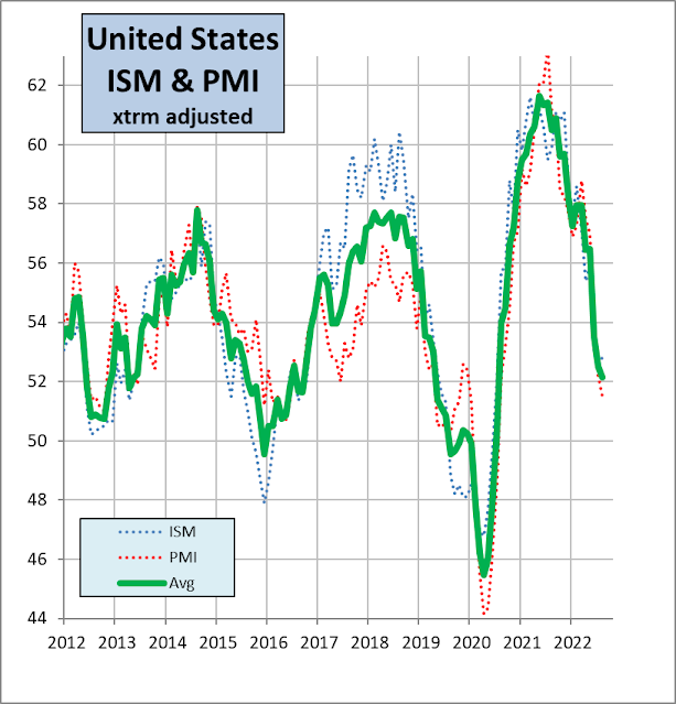
There are two national surveys of manufacturing conditions. The one above is from the Institute of Supply Management; the other is from S&P Global's PMI (Purchasing Manager Index) survey. If we average these two series after extreme-adjusting them, we should get an even closer picture of fundamental underlying trends, because these two series are (statistically) independent, having different samples, different survey days in the month, different methods of combination.
You can see this in the chart below, where the green line shows the average of the extreme-adjusted ISM and PMI surveys, which is smoother than either survey individually.
The key conclusions:
- The US economy continues to slow, but ...
- ... because a data point above 50% shows expansion, the economy is still expanding, just more slowly
- The 'green line' (average of the two surveys) is likely to cross the 50% level in December this year or January next year.


No comments:
Post a Comment